Visual Identity - Packaging
Hero Brand Design
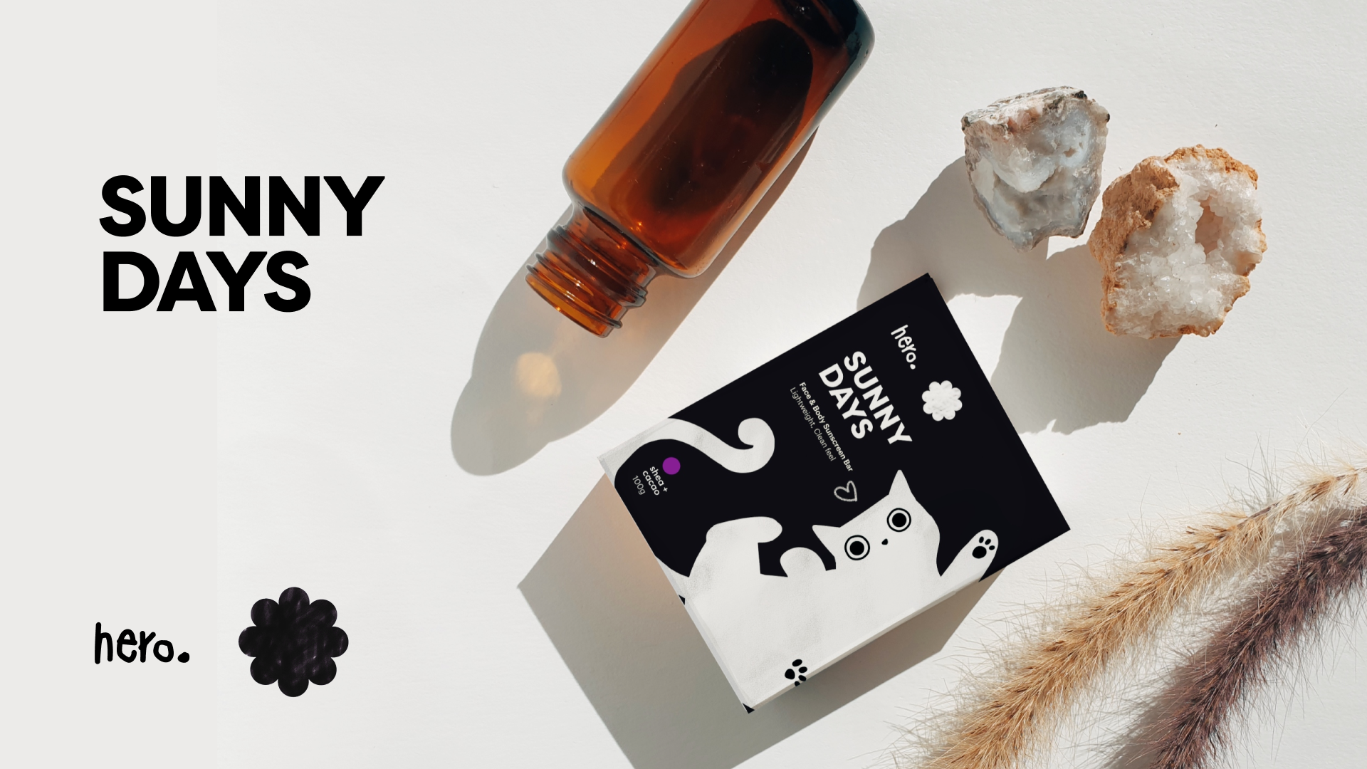
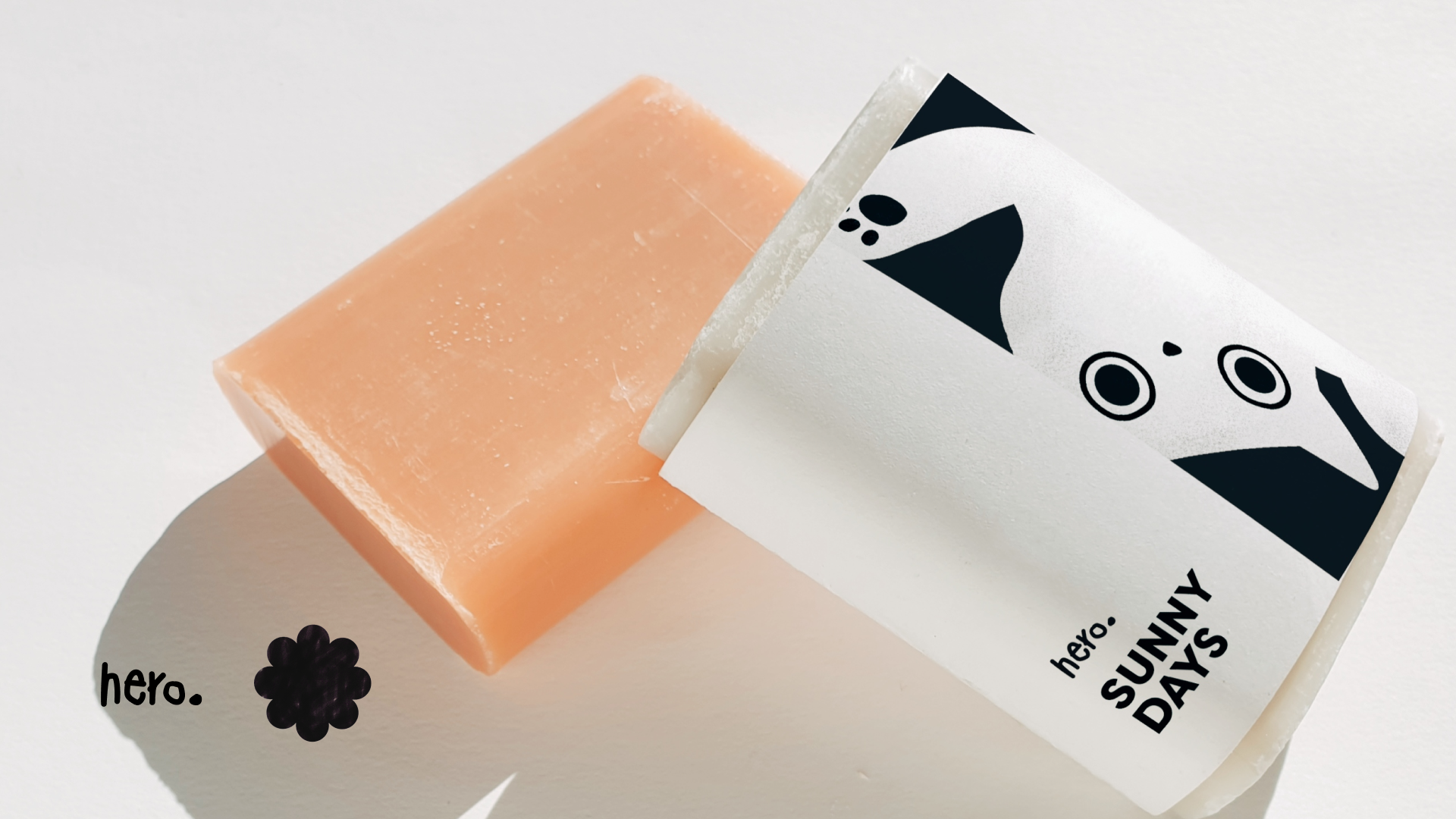
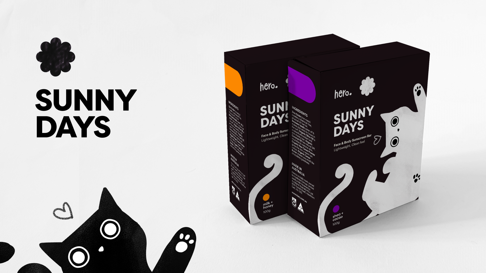
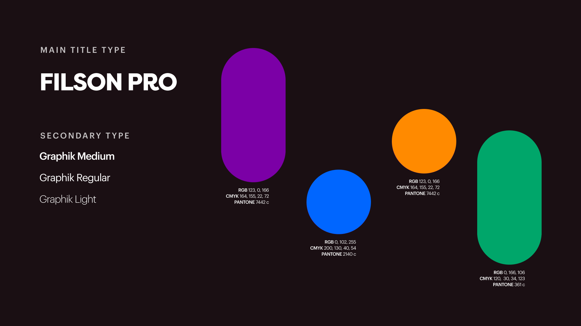
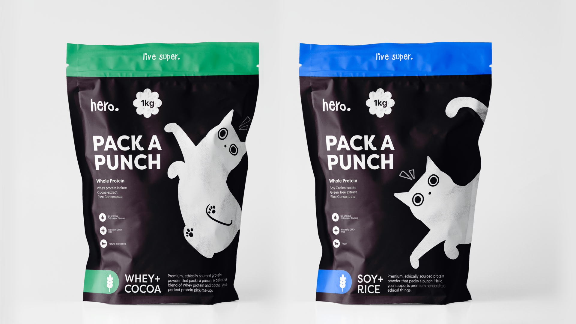
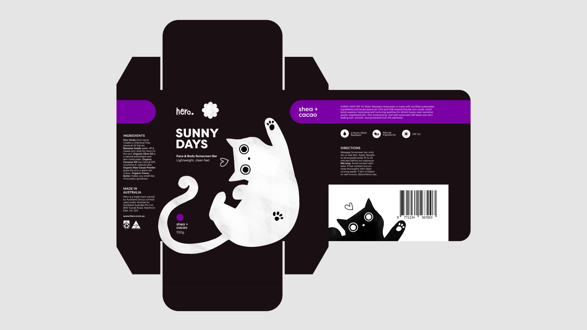
The purpose of this project was to develop a graphic language and identity for Hero's packaging. My approach was to create a consistent and coherent brand that was both accessible and recognisable. I achieved this by carefully considering the grid, layout, tone of voice, colour, logotype, illustration, icons, and the relationships between them.
Through the application of the visual identity onto two of the products, the Hero brand demonstrated it’s unique personality and communication style. As a health and wellness brand, Hero's goal is to make health products approachable, affordable and high quality for everyone. The brand encourages individuals to become their own hero by making good health decisions that benefit them and those around them.
Every design decision has the potential to include or exclude customers. Inclusive design emphasises the contribution that understanding user diversity makes to informing these decisions, and thus including as many people as possible. (What is inclusive design?, 2021)
